App — Retail
Penny App
Redesign and relaunch of the Penny app. Working closely with developers on both platforms, stakeholders and our design team, I helped complete and evolve the product — expanding the pattern library, designing user flows and bringing motion design into the app.
The problem
Penny’s app needed a full redesign and relaunch — a digital offering with Angebote, couponing and Scan & Go that millions of shoppers could use without friction.
My role
Designer for around 80% of the new features — Angebote, couponing, shopping list, settings, Penny Scan & Go — expanding the pattern library and introducing motion design with Lottie and After Effects.
Core decision
Design for the aisle, not the sofa. Motion confirms state rather than decorating it, and Scan & Go assumes an environment the interface cannot control.
The outcome
The relaunched app went live to a 4.7★ rating on the iOS App Store and 4.5★ on Google Play.
01 ChallengeDiscount grocery is a routine executed in a hurry. An app earns its place by removing seconds, not adding features.
Penny is REWE Group's discount grocery chain, operating a national store network across Germany. Its app serves a specific and demanding kind of use: people checking the week's offers before shopping, clipping coupons, keeping a list, and — with Scan & Go — scanning products themselves while moving through a store.
Discount grocery is a category defined by speed and price. Customers are not browsing; they are executing a routine, often weekly, often in a hurry, frequently one-handed with a basket in the other. An app in this context earns its place by removing seconds, not by adding features. Anything that requires attention it has not earned gets abandoned in favour of the paper leaflet.
The project was a full redesign and relaunch — not an iteration on an existing app but a rebuild of the product and the design language underneath it, shipping simultaneously to iOS and Android at national scale.
Scan & Go carried the hardest constraints of the set. Self-scanning inside a physical store puts the interface in an environment the design does not control: poor lighting, one hand free, network coverage that varies by building, and a checkout interaction that has to feel trustworthy to the shopper while remaining verifiable for the retailer. The tension between reducing friction and maintaining loss prevention is a real design problem, not a technical footnote.
- Roughly how many Penny stores nationally, and how many app users or downloads at relaunch?
- Was Scan & Go a full national rollout or a pilot in selected stores?
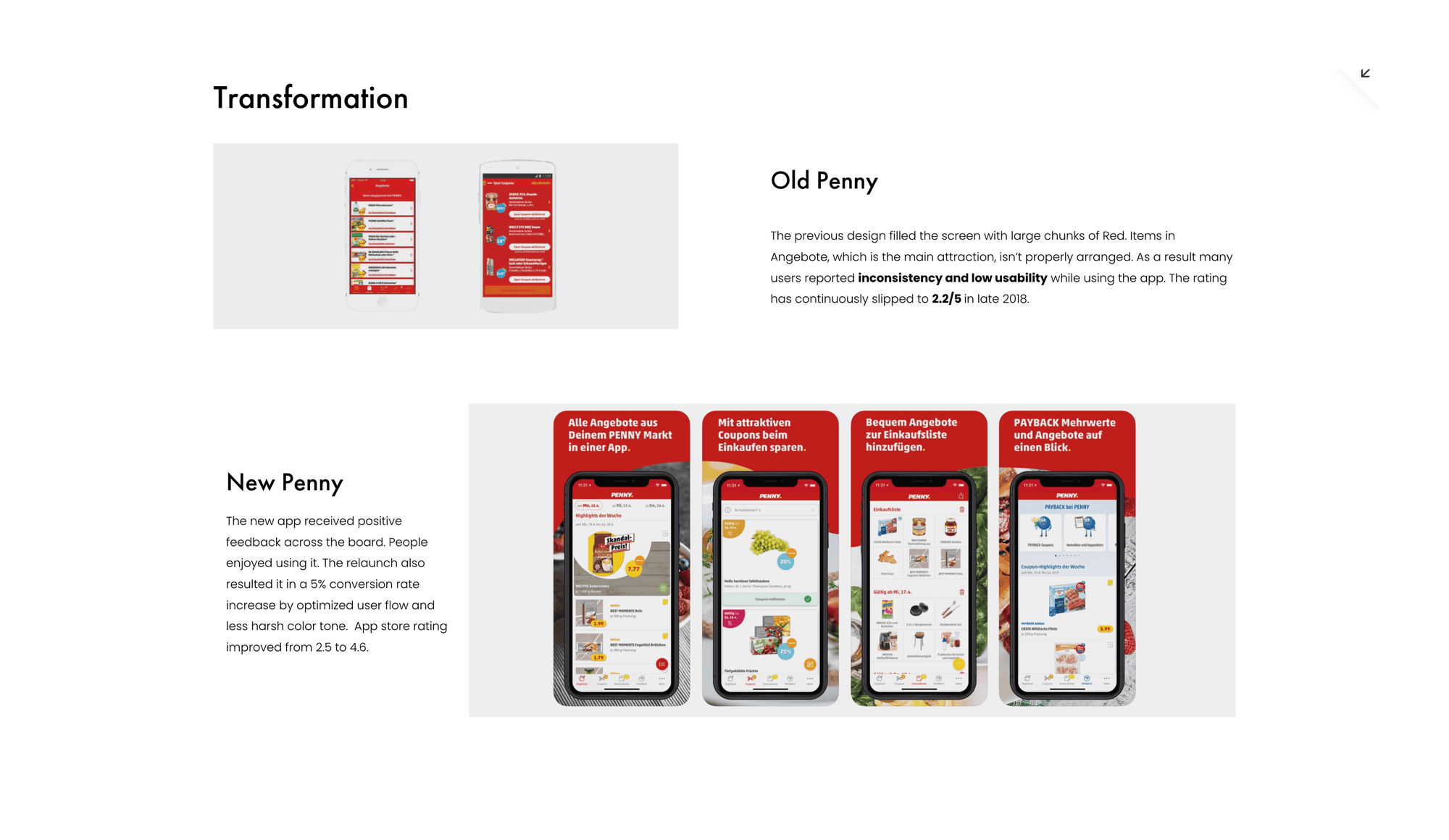
- What did the app look like before — was there a predecessor, and what was its rating?
02 My roleRoughly 80% of the new features, designed for iOS and Android in parallel.
I designed approximately 80% of the app's new features, working directly with developers on iOS and Android, with stakeholders on the retail side, and within the design team at REWE Digital. Designing for two platforms in parallel meant holding a constant question about where to follow each platform's native conventions and where the product's own consistency mattered more — a judgement that has to be made feature by feature rather than settled once by policy.
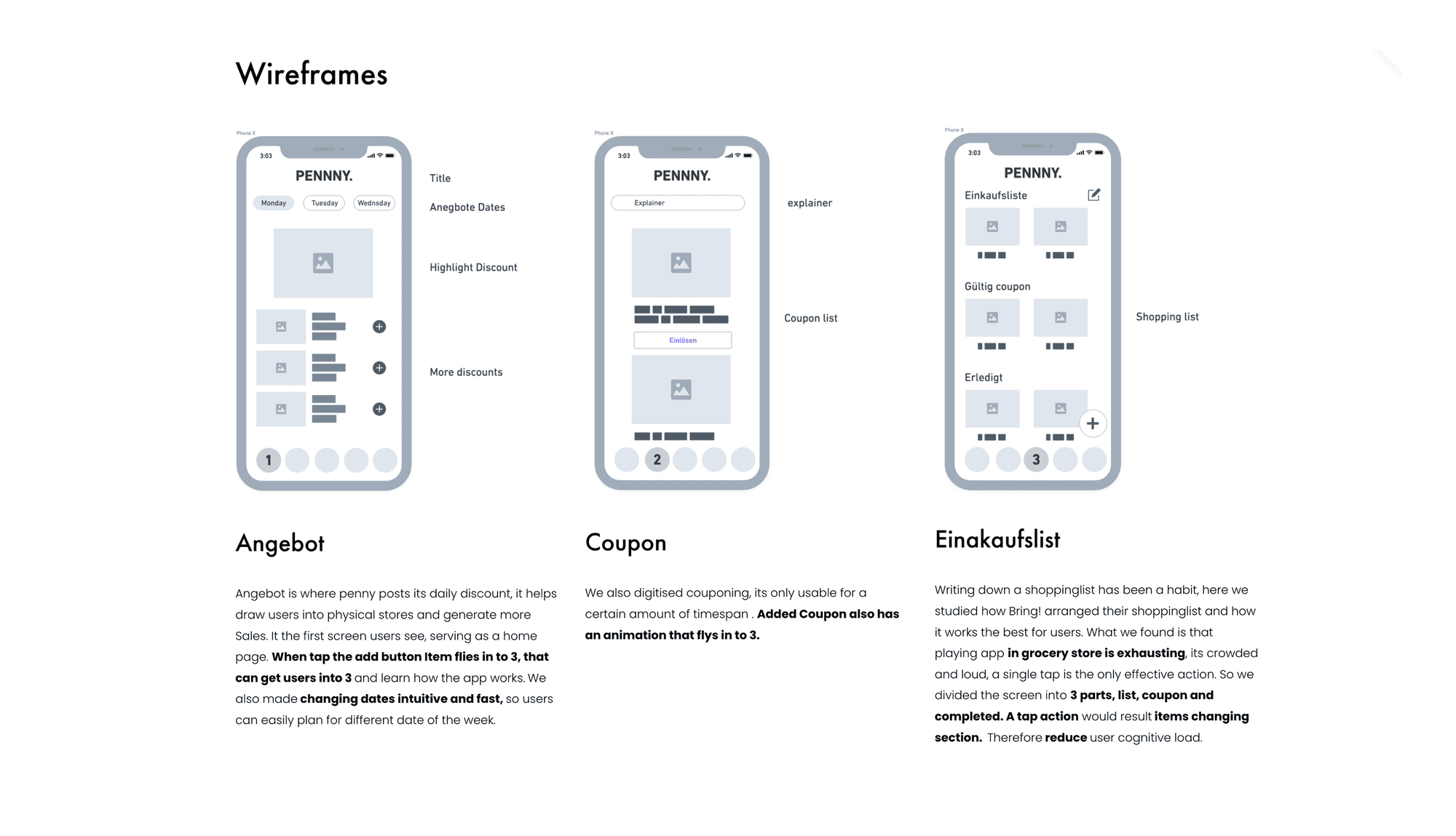
- Designing user flows and wireframes for Angebote, couponing, shopping list, settings and Penny Scan & Go.
- Expanding the pattern library so recurring problems were solved once and reused across the app.
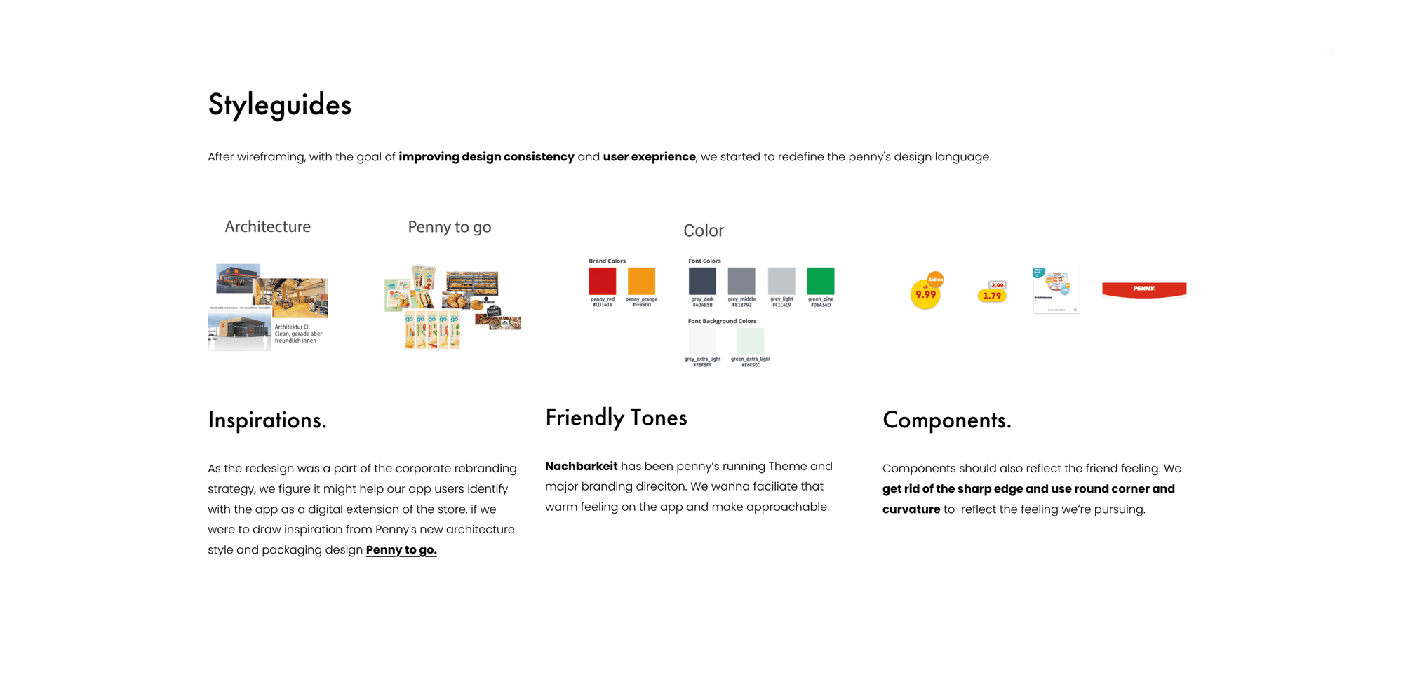
- Producing style guides and specifications to keep iOS and Android implementations aligned.
- Prototyping interaction behaviour for review and testing before build.
- Introducing motion design into the product using Lottie and After Effects.
- Brand design work and video production supporting the relaunch.
03 Designing for the aisle, not the sofaOne-handed operation, variable lighting and connectivity, interruption as the normal case.
Offers as the primary job
In discount grocery the weekly Angebote are the reason the app is opened. That makes offer browsing the spine of the product rather than one feature among several — it needs to be reachable immediately, scannable at a glance, and structured so that a shopper can move from seeing an offer to acting on it without navigating away from what they were doing.
Couponing has to be trivially simple or it fails
A coupon that requires understanding is a coupon that does not get redeemed. The interaction has to make three things obvious without explanation: that the coupon is now active, what it applies to, and that it will be honoured at the till. Ambiguity at any of those points converts directly into abandonment or, worse, into a bad experience at checkout in front of a queue.
Scan & Go operates in an uncontrolled environment
Designing an in-store scanning flow meant accounting for conditions the interface cannot assume away — one-handed operation, variable lighting and connectivity, and interruption as the normal case rather than the exception. It also meant designing feedback that gives the shopper confidence each scan registered, since uncertainty here produces re-scanning, double entries, and a checkout dispute.
Motion as feedback, not decoration
I introduced motion design into the app using Lottie and After Effects. In a product optimised for speed, animation earns its place only by clarifying state — confirming that a coupon activated, that a scan registered, that an item entered the list. Lottie made this practical at production quality without imposing the performance cost of heavier implementations, on devices across a wide hardware range.
- Which features went through user testing, and what came back? You listed user testing as part of the role — write up one round.
- Was there a feature that tested badly and had to be reworked? That is the most valuable story here.
- How did you resolve iOS vs Android divergence in practice — one example where you chose native convention over consistency, or the reverse, and why?
04 Outcomes4.7★ on the App Store and 4.5★ on Google Play — sustained ratings on a mass-market retail app.
Product
The relaunched app shipped to a 4.7★ rating on the iOS App Store and 4.5★ on Google Play — public, sustained ratings on a mass-market retail app rather than a launch-week figure. For a product used briefly and frequently by shoppers with no investment in it, that level of rating reflects an app that stays out of the way successfully.
Design practice
The expanded pattern library and style guides gave the app a consistent foundation across both platforms, and motion design entered the product as a working part of the system rather than as a one-off treatment.
Key learnings