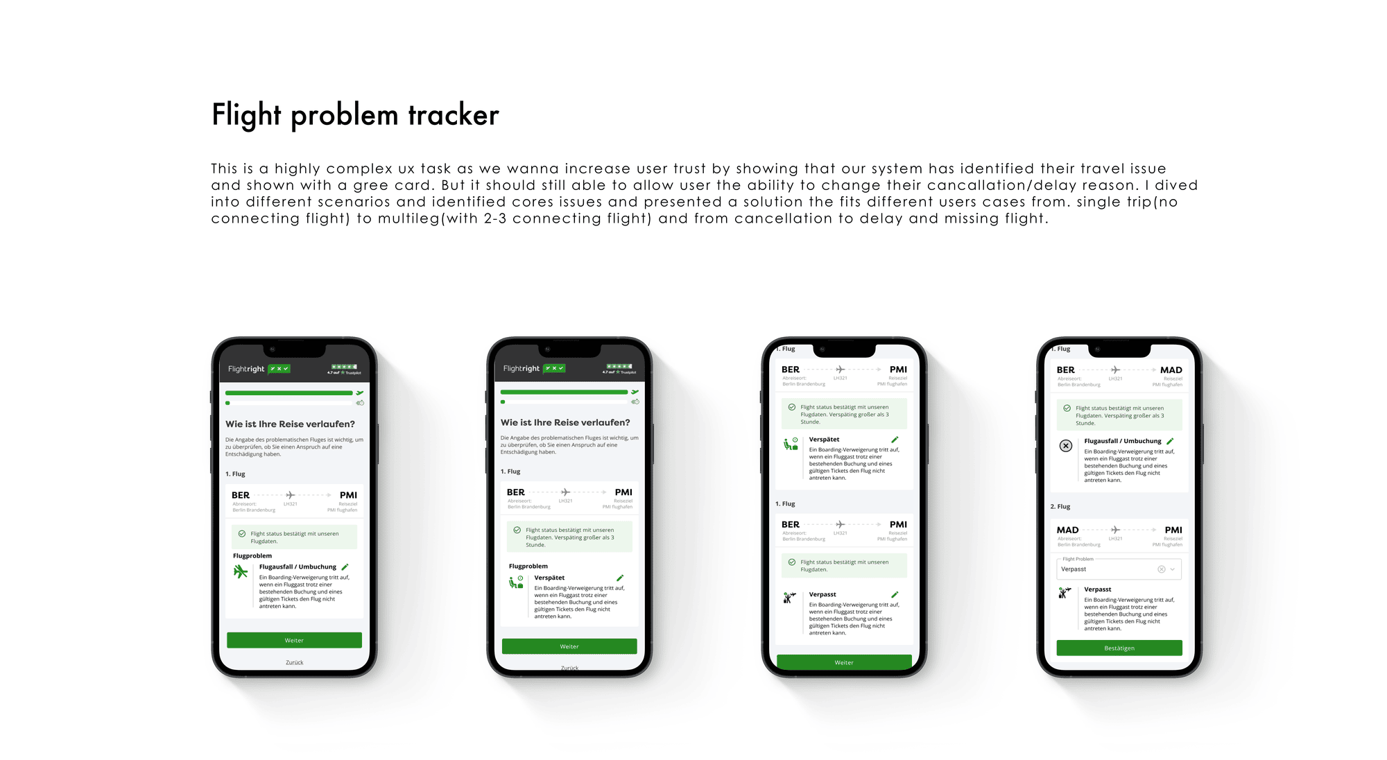
Web — B2C claim check · Current role
Flightright
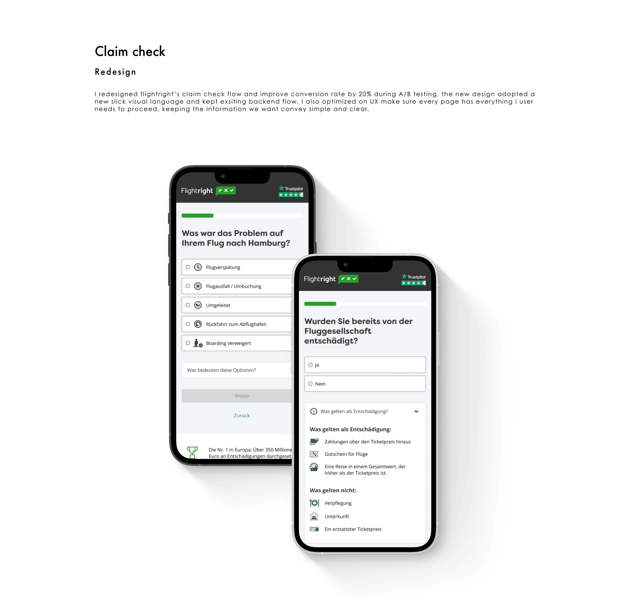
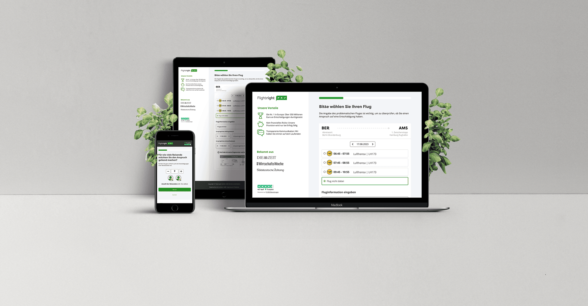
Flightright helps air passengers claim the compensation they’re entitled to under EU Regulation 261/2004. I redesigned key user flows and built the design system behind the claim-check product.
The problem
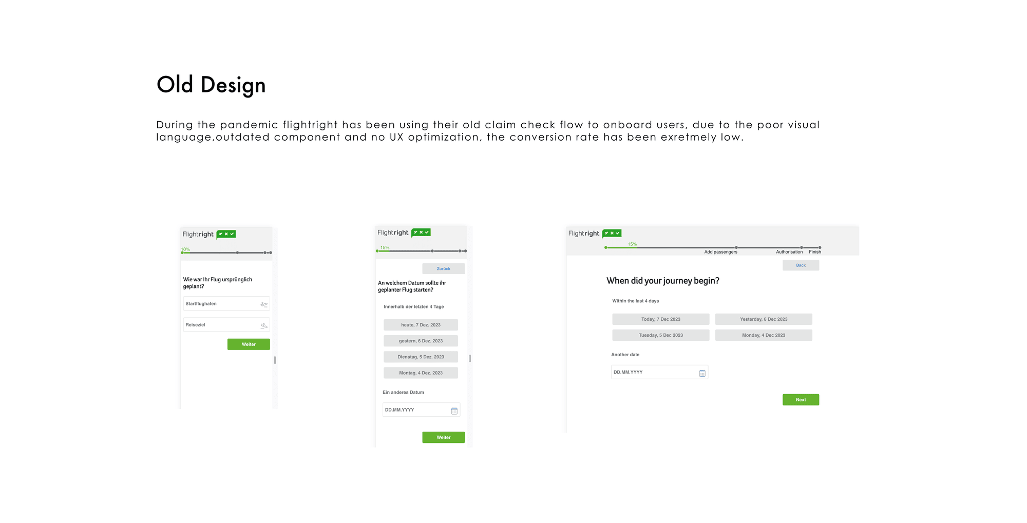
Claiming compensation for a delayed or cancelled flight is legally complex, and the existing flows lost users along the way. Key journeys needed a redesign — and the product lacked a unified design system.
My role
Product designer on strategic and operational level: building and maintaining the design system, prototyping, redesigning key user flows and supporting user and usability research, in collaboration with the CTO and Product Lead.
Core decision
Ask only what the passenger actually knows — flight number, date, what happened — and resolve eligibility against the regulation behind the interface, rather than asking users to self-assess.
The outcome
The redesigned flow converts more users — +5%, contributing roughly €3M in additional revenue — and the design system now keeps the product consistent as it grows.
“Due to his precise analytical ability, he is always able to understand complex situations immediately and to find good solutions straight away.”
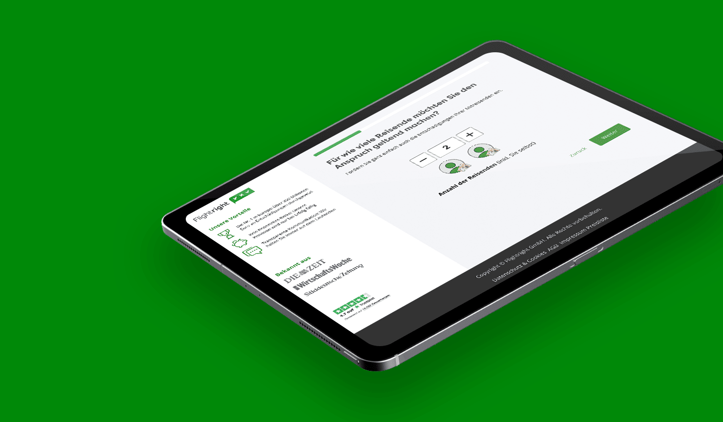
01 ChallengePassengers hold the legal right; airlines hold the interpretation. Every drop-off is a claim that never gets filed.
EU Regulation 261/2004 gives air passengers a statutory right to compensation when a flight is delayed by three hours or more, cancelled at short notice, or overbooked. Depending on distance, that entitlement is worth €250, €400 or €600 per passenger, and in Germany a claim stays enforceable for up to three years. The right exists. The problem is that almost nobody can tell whether it applies to them.
Eligibility depends on variables a passenger has no reliable way to assess on their own: arrival delay measured at the final destination rather than departure, the distance band the route falls into, whether the disruption counts as an “extraordinary circumstance” that releases the airline from liability, and whether a connecting segment was booked on a single ticket. Airlines contest claims on exactly these grounds. The result is a genuine information asymmetry — the passenger holds the right, the airline holds the interpretation.
Flightright exists to close that gap, and works on a success fee. That business model puts unusual weight on a single screen: the claim check. It is the point where a person with a plausible entitlement either becomes a case or leaves. Every drop-off in that flow is not a lost session — it is a claim that never gets filed and compensation that is never paid out. Conversion here is not a vanity metric; it maps directly onto revenue and onto whether a passenger receives money they are legally owed.
When I joined in 2023, two things were working against that. The claim-check journey asked users to carry the regulation's complexity themselves, surfacing legal nuance as user burden rather than resolving it on their behalf. And the product had no unified design system — patterns had been solved repeatedly and differently across the funnel, so consistency depended on individual memory rather than on shared components.
- Roughly how many claim checks started per month before the redesign?
- Which step lost the most people — flight lookup, disruption detail, or personal data / contract?
- What was the completion rate you were working against?
02 My roleSole designer on the claim-check product — the same person argues the case, specifies it, and sits with engineering while it ships.
I own design for the claim-check product end to end, reporting into the Product Lead and working directly with the CTO on feasibility and sequencing. In a team this size there is no handoff layer — the same person who argues the case for a change is the one who specifies it, prototypes it, and sits with engineering while it ships. That shapes how I work: decisions have to survive both a stakeholder conversation and an implementation review.
- Auditing the existing claim-check journey and identifying where legal complexity was being pushed onto the user.
- Redesigning the key conversion flows, from flight lookup through disruption assessment to case submission.
- Building and maintaining the product's design system in Figma, including component architecture and documentation.
- Prototyping interaction and validation behaviour for testing before committing engineering effort.
- Supporting user and usability research, and translating findings into prioritised design decisions.
- Aligning design direction with the CTO and Product Lead, and defending trade-offs against commercial and legal constraints.
03 What made the flow hardThe journey asked users to make determinations that properly belong to the system.
Regulatory complexity surfaced as user burden
The journey asked users to make determinations that properly belong to the system. Questions about circumstances, connection structure and delay measurement were put to people who had no basis for answering them accurately, and no way to know which answer helped their case. This produces two failure modes at once: users abandon because they do not know, or they answer wrongly and generate a case that is weak from the start.
The design principle I worked from was that the product should ask only what the passenger genuinely knows — flight number, date, what happened — and resolve everything else through data and logic behind the interface.
Trust was being asked for before it was earned
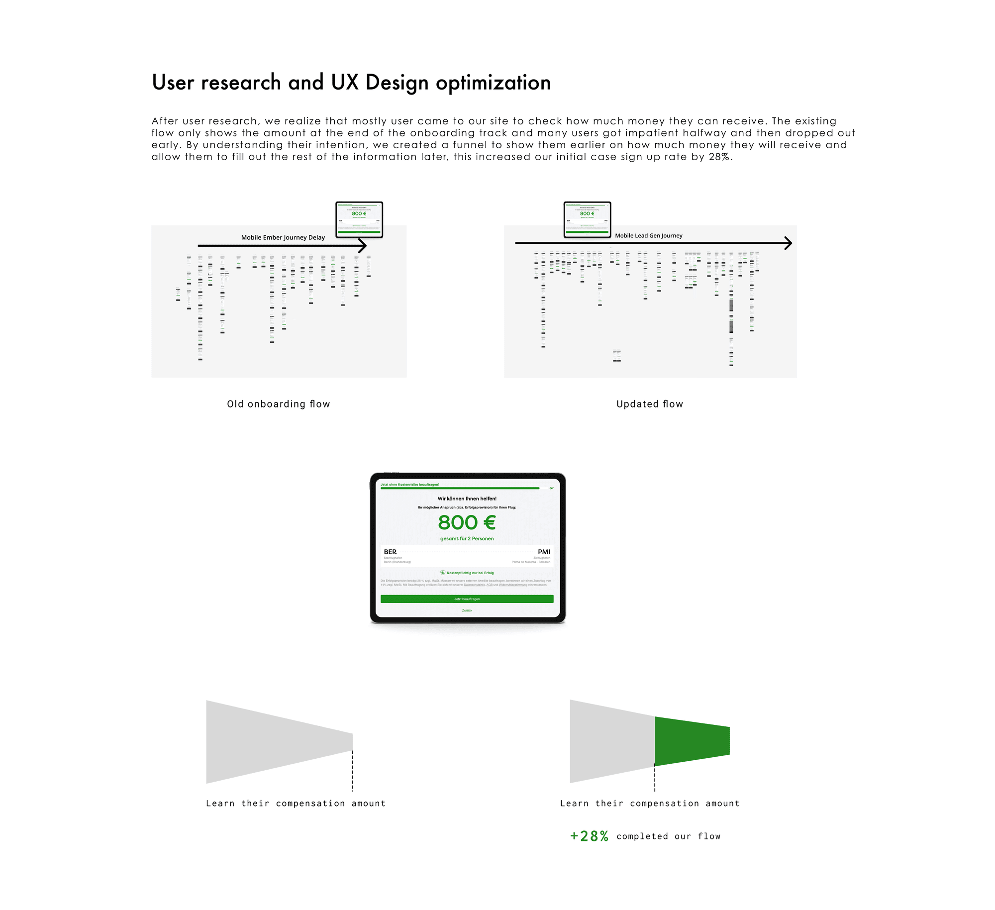
A claim submission requires personal data and a signed assignment of claim. That is a high-commitment step, and its placement relative to the eligibility result determines whether users experience it as a reasonable exchange or as an ambush. Sequencing the value — showing what the claim is plausibly worth before asking for commitment — is the central conversion lever in this kind of funnel.
No shared component language
Without a design system, recurring problems had been solved independently each time they appeared. Form fields, validation states, error messaging and progress indication varied across the funnel. The cost was not primarily aesthetic: inconsistent validation and error behaviour in a form-heavy, high-stakes flow directly produces hesitation and drop-off, and every inconsistency is a small signal that the product is less solid than the money it is asking you to trust it with.
- Anything from usability sessions — even informal ones. What did users say or do at the point they got stuck?
- Any support-ticket or customer-service themes that pointed at the same problems.
- Any analytics that confirmed the drop-off points you suspected.
04 Building the design systemFrom repeated one-off solutions to shared components with defined states — the mechanism that made the redesign hold.
The design system was not a side project running parallel to the redesign — it was the mechanism that made the redesign hold. Rebuilding the claim-check flow without a shared component language would have produced a consistent funnel that immediately began diverging again the moment other work touched it.
I structured the system so that design decisions live in one place and propagate, rather than being re-decided per screen:
- Foundations
Typography scale, spacing, colour and elevation as the raw styling options available to the product — static values with no product logic attached.
- Components
The form, feedback and navigation patterns the funnel depends on, with their states defined once: default, focus, filled, error, disabled, loading. In a flow built almost entirely from inputs, state coverage is the substance of the system rather than a detail of it.
- Patterns
Composed sequences that recur across the journey — question steps, validation and error recovery, progress indication, result presentation — so that the shape of an interaction is consistent even where content differs.
Alongside the library I maintained documentation covering when to use a component, which variant applies in which context, and what is fixed by the system versus what a given flow can customise. In a small team the documentation matters less as reference material and more as a way of making the reasoning inspectable, so that decisions do not have to be reconstructed from the file every time someone new touches the product.
- How many components does the library contain? Roughly is fine.
- Was it adopted beyond the claim-check product — marketing site, back office, partner flows?
- Did you set up tokens or variables in Figma, and were they mirrored in code?
- Any measurable effect — faster handoff, fewer design QA issues, less rework?
05 Outcomes+5% conversion, roughly €3M — and in a success-fee model, compensation reaching passengers who would otherwise have abandoned.
Product
The redesigned claim-check flow increased conversion on key journeys by 5%, contributing approximately €3M in additional revenue. In a success-fee model that figure has a second reading: it represents compensation reaching passengers who, in the previous flow, would have abandoned before finding out they had a valid claim.
Design practice
The design system moved the product from per-screen decisions to shared components with defined states and documented usage. Consistency stopped depending on individual memory, and new work now starts from an established pattern set rather than from a blank frame.
What I would do differently
- What did you get wrong first and have to revise?
- What did you underestimate — scope, stakeholder alignment, engineering effort?
- What would you sequence differently if you started again?